
Hmmm…almost exact 15 years after the 2007 MS design patent on Calibri (which had a duration of 15 years) they switch to a new, alternative Office-exclusive font for the next 15 years.
Only to be used ‘freely’ for personal use and again probibited to be bundled with, let’s say, other products like LibreOffice.
It’s all about lock-in and revenue, plain and simple. The same business strategy like Apple with the default San Francisco font and Adobe with the default Minion Pro font. I understand why they do it this way, I just don’t like it.
aren’t they all basically helvetica anyway?
GreatValue brand Helvetica. They muck up the lines and they look awful imo
Microsoft gonna Microsoft.
Damn. I was hoping it would be Papyrus.
But how would avatar 3 use it as a vaguely tribal and exotic suggesting font then
Who has libre office, all fonts you can imagine plus a few hundred and doesn’t care? Actually, I write my stuff in neovim, mostly, some special cases still need a word processor of some kind.
This is the way. I like neovim too.
Friendship with Calibri ended. Aptos is my new best friend now. [insert related meme here]
But… I like Calibri… 🙁
I really liked the squircled I dots.
Too bad you are forever doomed to using Aptos since it’s impossible to change fonts.
I am, tho’. If it’s the new standard Windows font, it’s going to become the new standard communication font at work.
I hate how people (not us but most people out there) are so profoundly lazy so as to do exactly this. Changing your default font in the options is too much apparently. So everyone becomes forced to use the default.
Calibri would be ok as a default font in my book, if they had taken the time to further differentiate a capital “I” and a lowercase “l”
Honestly how does something like that just go untouched for years.
I get so many emails sent to me incorrectly because of that.
I work with codes a lot. And so it’s not like I can figure out what the character is based on context. It’s a code, it can be either one.
I manage a few shared mailboxes, so I’ll often get an email meant for “hlt” to the “hit” box. The scary thing is that all of these emails contain identifying personal information for clients and these people aren’t even making sure they have the correct email address before hitting send.
Book Antiqua gang rise up!
Is this maybe a ploy to date things again? I can’t remember exactly what it was (I think it was in a Darknet Diaries episode) but there was a court case where a guy came in with a document proving something in his favour. It was a contract or letter from the other side of his case. They managed to prove it was fake because it was in Calibri, Office’s default font, which hadn’t even been invented back when the document was supposedly written.
Amateur. Always use Times New Roman.
On a serious note, it sounds like a transition to fonts that better support scaled 4K and up monitors.
Doubtful it’s a technical decision. That font doesn’t look any better than other fonts on hidpi.
You might be right. Windows at 150% scaling has the fonts looking pretty ok… 🤔
Should have kept the original name though.
“Bierstadt” would have been awesome!
They are not actually entirely identical. Bierstadt will be available in its original form, while the new font have a significantly wider spacing between characters.
The confusion on pronunciation alone would have been worth it!
It’s Bierstadt like Ale town or Beer city. And yes, Bierstadt works in German and is a part of Wiesbaden.
Is there a good design comm here yet?
Arial or bust
🕈︎✋︎☠︎☝︎👎︎✋︎☠︎☝︎💧︎ ☝︎✌︎☠︎☝︎ ♐︎□︎❒︎ ●︎♓︎♐︎♏︎📬︎
It’s too late, Nawaz Sharif was already impeached.
At first I thought there was something strange about the “s,” but I couldn’t put my finger on it. So I looked at the other fonts they considered and I realized I didn’t like the “s” in those either. Then I looked at the font on the webpage and realized all "s"es look wrong to me.
I guess I just have to live this way now.
WE’RE ALL LAMBS TO THE COSMIC SLAUGHTER
Don’t you dare continue to spread that curse. I’ve started taking a slightly longer at the s’es Ive typed and I am not sure I like what I see.
deleted by creator
Helvetica gang here
Verdana was my poison.
Edgy 10pt Arial Narrow here.
Edit: Can we bring back personalized background color, font color and font like we’re on AIM in 1998?
Real nerds use Neuropol X
Never was included in MS Office, sadly
But Arial is Sans Serif and TNR is Serif, they serve different purpose.
deleted by creator
Kids these days and their fancy distinction between serif and sans fonts
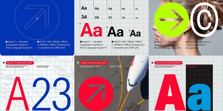
Aptos was created by Steve Matteson, who is also responsible for Windows 3.1’s original TrueType fonts (including Times New Roman, Arial, and Courier New) as well as Segoe, which has been Windows’ default system font since Vista and is also used for Microsoft’s current logo.
Fuckin’ hell though. You gotta respect someone who’s been in the game that long. And his one, single, sole job is fonts. That’s dedication. Or maybe just a gravy train. But either way, dude has predicated an entire career on how letters look. Mad respect.
Well when you put it that way. Fuck yeah. I agree.