

You must log in or register to comment.
That graph hurts my data scientist heart
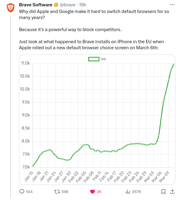
It’s common practice to cut the y axis, did you guys not cover that in visualisation?
That graph hurts my data scientist heart
It’s common practice to cut the y axis, did you guys not cover that in visualisation?
