
So blue for upvote, red for down and then an updated Sync logo.
no
Test
Those look slick!
As long as the blue/red colors are different enough from the current colors, that’d make it a less confusing change. Even if the colors don’t change, I think it’s best to match Lemmy’s setup.
I think they should. Would be nice if you could change the app icon and then the upvote/down vote colors and then give the option to reverse the upvote/down vote colors.
I would like it to be opt-out because years of Sync for Reddit taught me “orange is upvote, violet is down vote and red is hide” when using swipe to vote/hide.
deleted by creator
Inverted vote colors don’t even make sense! Up is uncreasing temperature i.e. warmer color.
deleted by creator
Yeah omg this is fucking with me so bad. I may as well let Discord update at this rate!
Design language wise, it would make sense
deleted by creator
Personally, I want a way to reverse the vote colours on the buttons…
I think this should be an option, but I’d also retain classic Sync up/down colours too for those who want to stay with it. I’m not sure I could ever get used to blue being an upvote, but I get why some might want it to.
Ideally there’d be a config option to switch, but if I had to choose one I’d like Sync to follow the lemmy color scheme.
I was against the change when I read this post, but now I have to say I love the ice blue color on the AMOLED black background. Nice.
Can you give a mockup of the logo with red?
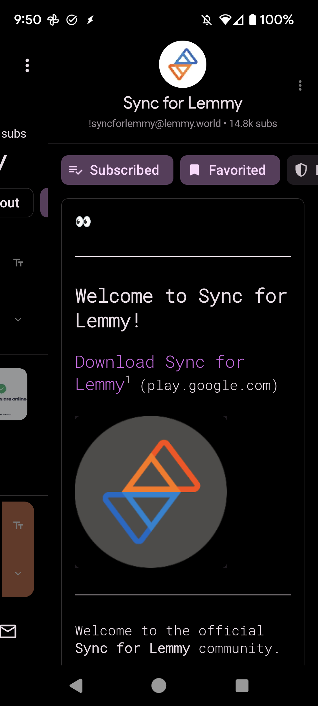
If you look at the “about” page for this community, the community avatar is blue=up and red=down, but a bit lower is the red=up and blue=down. That’s what I see, at least.
Edit:
This would be nice!
Yes please
Bruh even google does’nt pull that shit . Is’nt ads in feed enough ? But i guess dev gotta eat and the feed ones alone doesn’t cut it my opinions are split in this matter.
Come on man, you stoned af again‽
It sounds reasonable, yes.
i don’t care but id love to be able to filter out image posts also I love you bb