

No it doesn’t.
It’s meant to illustrate a change and it does so perfectly fine. It’s not a scientific paper.
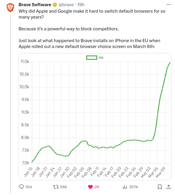
It’s a 32-34% increase looking at the graph. That’s significant enough to shout about.
Imagine any change you could make surprising competition by 25% in any market. That’s huge.
It’s meant to illustrate a change and it does so perfectly fine
Define “perfectly fine”. It is clearly exaggerating the change. At a glance it looks more like a 5 times increase, not a 30% increase.
Of lies, damned lies, and statistics this graph is certainly one of them.
It’s a 32-34% increase looking at the graph
But you don’t get that percentage from looking at the graph. You get that from looking at the numbers.
The graph height increases by 300% in the last3 months9 days.Did you know that disco record sales were up 400% for the year ending 1976, if these trends continue…AY!

True.
You could say the same about a 0.001 difference if you zoom in on the y-axis. You don’t know what you’re talking about.
A 0.001 difference on a 0.004 total would be worth showing.
That was a bad example. Try 1,000,000 moving up to 1,000,069.
I’m sticking with relevance. A >25% rise is what we’re talking about.
A 25% raise would show up with the y shits at zero. As would any significant increase.


