

You must log in or register to comment.
It’s meant to illustrate a change and it does so perfectly fine
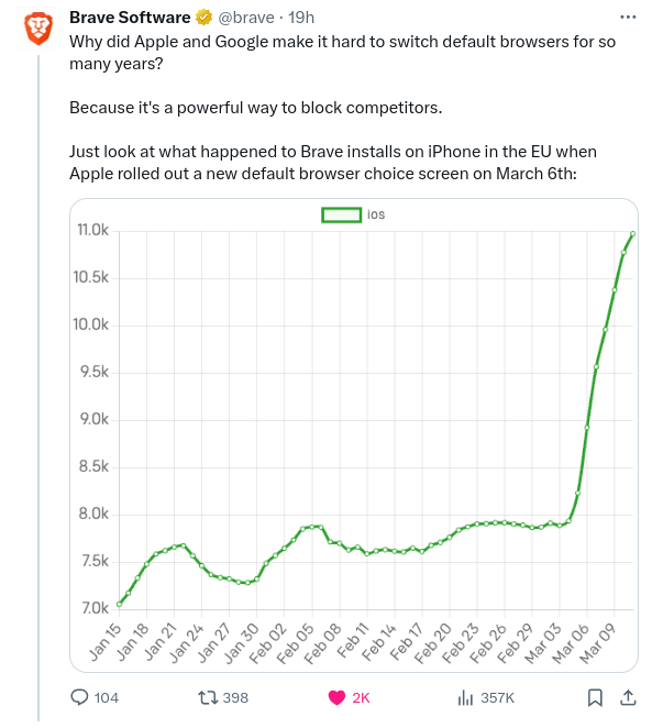
Define “perfectly fine”. It is clearly exaggerating the change. At a glance it looks more like a 5 times increase, not a 30% increase.
Of lies, damned lies, and statistics this graph is certainly one of them.

