

You must log in or register to comment.
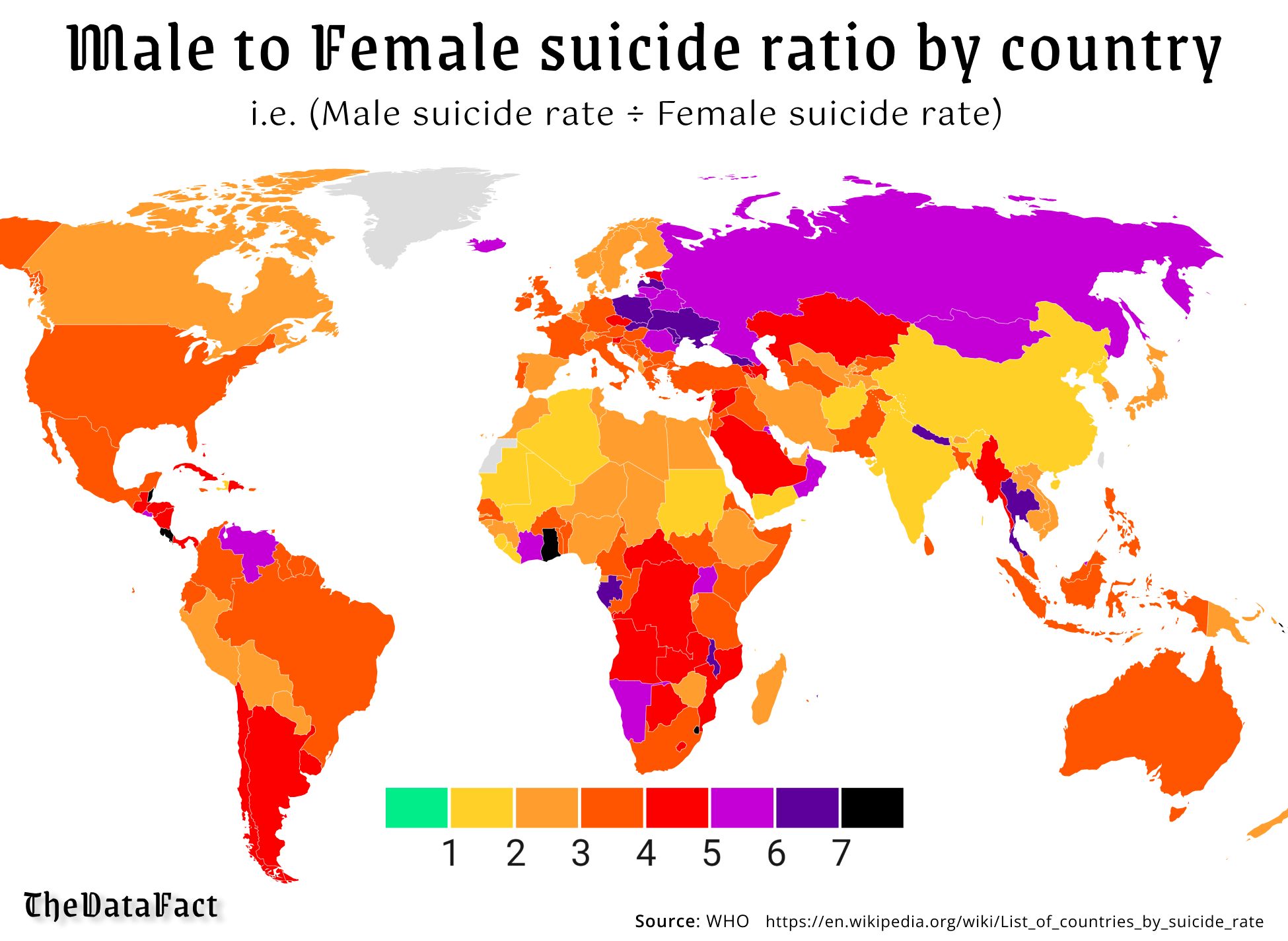
If it is green then they have the same average right? 1:1. But in this graph it would be difficult to show when more women committed suicide, which might nowhere be the case.
Or you’d get 0.5 with a color match, for example.
Women literally never commit suicide at the same rate or less, that’s kind of the point.
Ok, but if you (me) didn’t know that coming into this, you’d be confused why it only scaled one way. I would’ve figured there’s at least some parts of the world where women had higher rates than men.