

You must log in or register to comment.
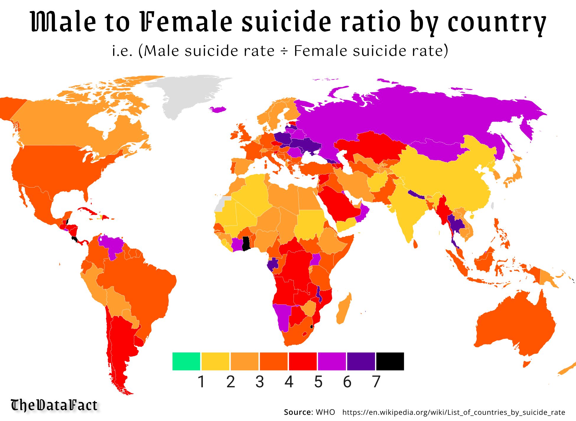
Why? The red and orange are close in color, otherwise it shows if it is green in color, more women commit suicide than men, then the ratio goes up by color
If it is green then they have the same average right? 1:1. But in this graph it would be difficult to show when more women committed suicide, which might nowhere be the case.
Or you’d get 0.5 with a color match, for example.
Women literally never commit suicide at the same rate or less, that’s kind of the point.
Ok, but if you (me) didn’t know that coming into this, you’d be confused why it only scaled one way. I would’ve figured there’s at least some parts of the world where women had higher rates than men.
You needed to explain that for it to make sense
That’s the point of the color bar on the bottom, a part of any good graph
The color bar means nothing without any label.
The numbers, right there on the bar, and the text at the top of the image.
“male to female suicide ratio” and then the numbers 1-10, it even explains that it’s (men’s suicides / women’s suicides) so anyone who doesn’t know what a ratio is can enjoy as well
- 1: same number of men and women
- 2: twice as many men, as women
- 3: three times as many… Etc
- x: x times as many men
Does this help?
It does but if it was good it wouldn’t need an explanation.
The title explains it… If it isn’t clear by that, it explains what that means in the text below. That my explanation was necessary is not really the fault of the infographic
I disagree.
I agree with the OP. You’re bad at reading graphs, unfortunately
Apparently I’m not the only one since this thread was started by someone else who was confused. And should you have to be good at reading graphs to understand one? They should present the information in a clear easy to understand manner. This failed at that.

